|
|
|
|
|
|
|
|
|
|
|
|
|
|
|
|
Anyway, I'm running out of fuel...I doubt that I will be able to respond to any real minor changes, unless it was from the GGG & SOS camp, and we were on our way to some final logo of some sort. I do this because of time constraints, and the fact that I find the logo debate very tiring. Currently I'm working on my own Fantasy Campaign Setting called "Agyris"; it uses Fudge for it's mechanics, though there isn't really any mechanics up yet. Have a sneak peak, if you want. I'm trying to spend my time for this project, which is becoming massive. I used Dom Casual because of requests and the fact that it has been used for the Fudge logo before. I don't really like D. Casual for logos (I think that it is the weakest font on this page), since it reminds me of used car signs. However, I do like it on the Expanded Edition cover because it feels friendly and accessible. So maybe it's really not that bad. These (9-11) are actually bunnies, believe it or not. They are from a comic that I was going to do at one time called "dazzlegas." Since I was running low on fuel (from the endless logo debate) I wanted to do something funny and somewhat inappropriate. I'm not into bunnies for the logo at all, though I could live with this one due to my massive ego. (har) Thank you for checking this page out. Daniel |
|
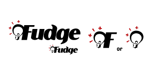
Logo - Reduced Logo - Icon #1 - Icon #2 |
#1 Lightbulb. Yes, a lightbulb. I think that RPGs are about ideas, imagination and inspiration. Fudge is no different. In fact, I believe that Fudge is more about ideas and inspiration than most games. This, like the others, is done as a basic 2 color design. I want people to concentrate on design, rather than color. Color could liven things up, but first things first! |
|
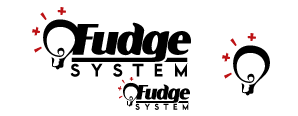
Logo - Reduced Logo - Icon Idea |
#1.5 Lightbulb. As per a request by Dr. Ian McDonald (a good fellow), here is a system version of the lightbulb logo. Since the lightbulb was shifted downward to balance the added "system", it works better as an icon than does the lightbulb & F. It was challenging to make the "g" in Fudge not interfere with the word "system." The "system" font has just one case; upper. |
|
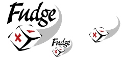
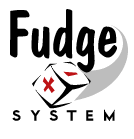
Logo - Reduced Logo - Icon Idea |
#2 "Comin' at Ya" Die. Yeah, I know, a few of you don't want a Fudge die, and some of you do. So here is one with a die. It would work well as a corner logo. This, like the others, is done as a basic 2 color design. (black, black halftones, and red) I want people to concentrate on design, rather than color. |
|
Logo - Reduced Logo - Icon Idea |
#3 Lightbulb. See "Lightbulb #1. This one is more stationary and a bit more conservative than #1. This, like the others, is done as a basic 2 color design. I want people to concentrate on design, rather than color. |
|
Logo - Reduced Logo - Icon Idea |
#4 Techy. This one is more funky, and my has the least to do with Fudge. I liked the font alright, but it is not quite as readable as the others. Nothing earthshattering here, I wanted to expose each idea, so here it is. This is done as a basic 1 color design. I want people to concentrate on design, rather than color. |
 1
1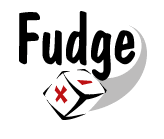 2
2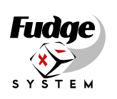 3
3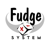 4
4 5
5 6
6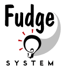 7
7 8
8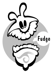 9
9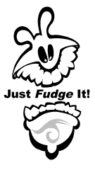 10
10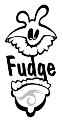 11
11